Why Does McDonald’s Use the Colors Red and Yellow?
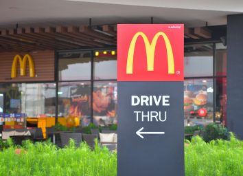
There are few brand logos as iconic as McDonald’s yellow Golden Arches resting against a bright red background. If you’re like many people, seeing that neon sign on the highway makes you picture a warm, savory Big Mac and crispy, salty French fries—and there’s actually a scientific reason for that. The red and yellow color scheme McDonald’s uses is a powerful marketing tool. Just the sight of that yellow “M” amid a sea of red can actually stoke your hunger for fast food. So before you fall for it on your next road trip, take some time to understand the science behind those cravings and why McDonald’s colors are red and yellow.
Color has a huge impact on our brains.
A 2011 study in the Journal of the Academy of Marketing Science examined the science behind how humans process color, as well as how color psychology is being used in marketing today.
It turns out, colors have a tremendous impact on how our brains store and process memories, even from a very young age. Savvy brands have honed in on the power of color to drive us to make purchases—and McDonald’s has mastered that approach when it comes to fast food.
OK, but why does McDonald’s use the colors red and yellow specifically?
Satyendra Singh, a professor of marketing and international business at the University of Winnipeg, has studied the use of color in marketing. He’s examined how specific hues can influence the way we feel, see, and think. In a 2006 paper for the journal Management Decision, Singh noted that the color red “stimulates appetite.” And Karen Haller, one of the foremost authorities on how colors influence buying decisions, told Business Insider that red is linked to “energy” and “excitement.”
The distinctive, cheery yellow of McDonald’s Golden Arches is also no happy accident. Singh said that fast-food companies tend to use the bright attention-grabbing color to “hijack customers’ interests.” Haller also pointed out that yellow tends to connote “happiness, optimism, and friendliness.” Plus, it’s the most visible color to the human eye during daylight hours.
A friendly place to eat that makes you think of happiness? That sounds like someplace you’d like to be, right? Sounds like you’d crave a trip to McDonald’s when you see that red and yellow sign on the highway.
On top of that, red and yellow are the colors of two classic McDonald’s condiments.
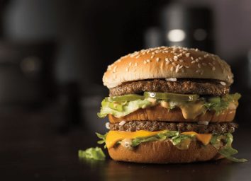
In 2018, Paul Findlay, an Australian advertising executive, wrote an article about how the combination of red and yellow reminds us of ketchup and mustard. Findlay asserts that the McDonald’s logo, therefore, evokes the experience of enjoying a Quarter Pounder slathered in those bright, distinctive condiments in our minds.
“This simple and very stealthful, sensory trigger lures even the best of us helplessly towards the prize like a pack of fast-food zombies heading eagerly towards a McBrain Burger,” he wrote.
But McDonald’s isn’t the only fast food chain to use the colors red and yellow.
Burger King, Carl’s Jr., In-and-Out Burger, and Sonic—to name a few—have all used red and yellow in their branding at some point. So if you find yourself imagining a juicy burger and fries the next time you see the McDonald’s logo, it might not be actual hunger, but a reaction to that carefully selected red and yellow insignia that makes you feel that way.