This Is the Secret Meaning of Taco Bell’s Logo, According To Customers
Taco Bell is a fast food chain that’s been hustling on innovation. This week, their all-digital location opened in Times Square, and soon customers can place their order through social media or text message. But today, social media is going loco over the classic Taco Bell logo after some groupies of the Bell have zoomed in on an alleged hidden meaning.
Fast food brands are prime proof that there’s a lot of recognition power in logos—but some fans of Taco Bell have taken this examination to a new level. Social media is buzzing with what some Taco Bell lovers insist they’ve identified as a hidden meaning inside the bell. Take a look at the yellow clapper, which Creative Bloq points out as the ball inside the bell that creates the dinging sound. That’s right: in the illustration below, the yellow part of the Taco Bell logo actually strikes some resemblance to a taco.
I’ve scoured the internet and somehow no one seems to have noticed before yesterday that the Taco Bell logo is actually a taco bell. This was discovered and pointed out to me by the author of Dragons Love Tacos, Adam Rubin. from r/DesignPorn
How strong is your agreement here? Mild? Medium? Some Reddit users are participating in quite a debate, with some kinda buying in to the Taco Bell logo theory, while others aren’t having it. Said one: “Or, hear me out, it’s just a bell. If they wanted to emphasize the taco shape, they could have turned the bell upside down and added a little lettuce around the outside.”
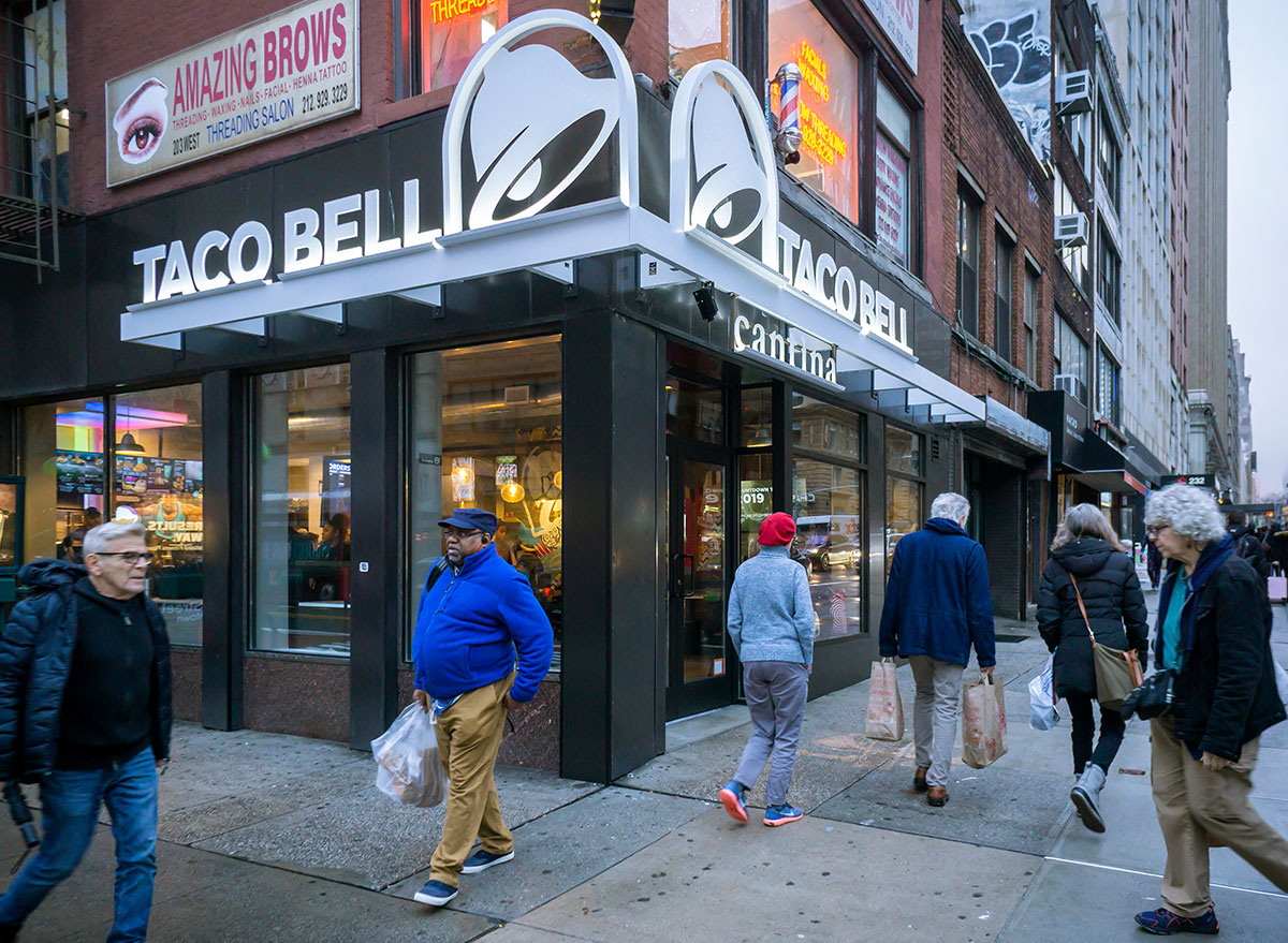
Hey—we aren’t ones to criticize imagination. The Taco Bell logo has been the source of plenty of debate in recent years, as some of the design-minded set criticized their move away from the purple, hot pink, and yellow logo above to a clean white illustration in 2015—their first logo change in 20 years. Just like a favorite order, why mess with a good thing? At the time, Advertising Age reported that corporate decision-makers felt the more modern white design would lend itself to better customization for campaigns and other promotion purposes.
Check out more analysis of Taco Bell’s logo in 7 Fast Food Messages with Hidden Meanings. (Heads-up: you were so wrong if you thought the McDonald’s golden arches were meant to call French fries to mind…)
Sign up for the Eat This, Not That! newsletter for daily delivery of the food news everybody’s talking about.