11 Packaged Foods With Hidden Messages in Their Logos
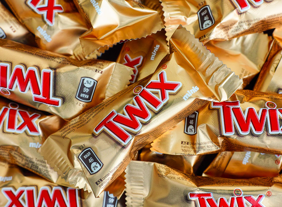
When you pick up some of your favorite classic packaged foods at the grocery store, seeing those bright logos and symbols on the packaging is probably familiar and comforting to you. But did you know that some of those symbols actually have significant meaning? These logos have been perfected over time, with carefully chosen hidden messages in logos that represent the company’s history.
Here’s the hidden messages in logos of your favorite packaged foods, so you can look out for them next time you’re at the store.
Betty Crocker
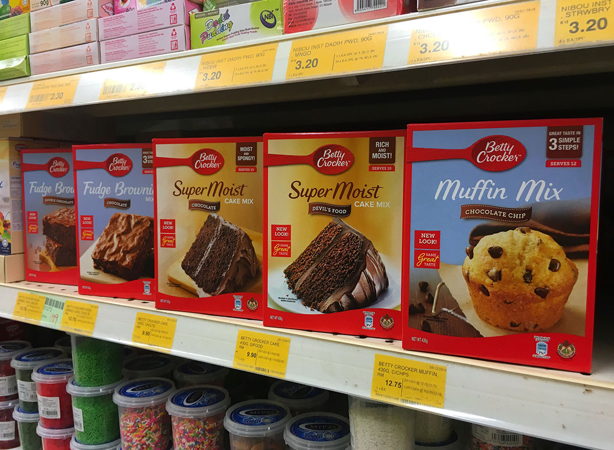
While a big red spoon makes sense for a brand like Betty Crocker (where you mix up some delicious cakes and other meals), the meaning behind is actually very sweet. In the 1950s when the original Betty Crocker red logo was switched to a simple red spoon, a published pamphlet compared Betty Crocker and the spoon as being the same type of kitchen helper. The pamphlet said that both a spoon and Betty Crocker are “a symbol of good products and recipes, a friendly, homemaker’s guide…a familiar household implement she uses every day in mixing, cooking and eating.”
So not only is the familiar red spoon a logo that symbolizes Betty Crocker, but it also serves as a symbol of comfort and guidance in the kitchen—something that Betty Crocker strived for in her work.
Tostitos
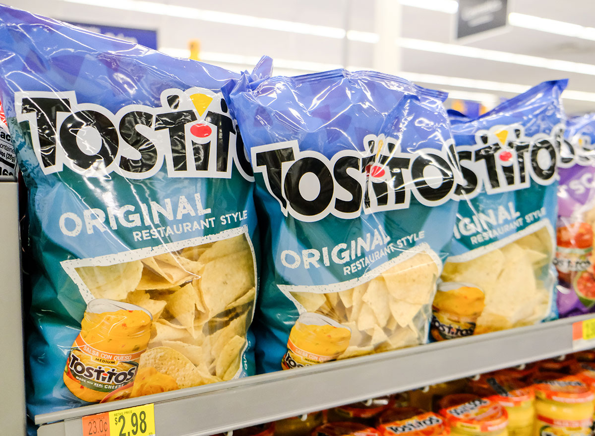
Chips and dip are meant to be together, and Tostitos is the king of both. Even their logo says so! Did you notice that the two t’s in Tostitos are holding a chip that’s being dipped into a bowl? Clever, right? If you weren’t paying attention, you’d probably miss it. But now that you see the two little people enjoying chips and dip, you’ll never be able to see the Tostito’s logo the same again.
Lay’s
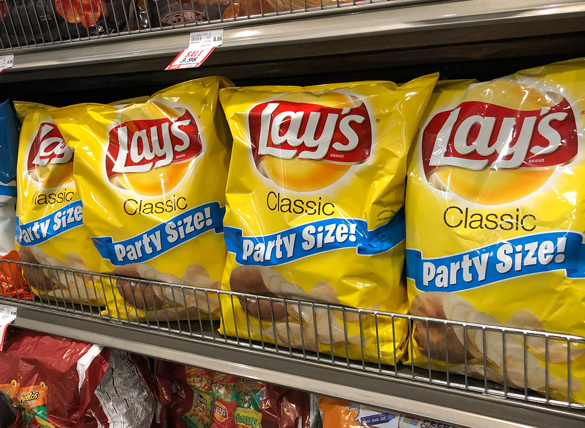
Have you ever noticed that the Lay’s chip logo looks a lot like the Frito Lay logo? Lay’s is owned by Frito Lay, and both logos have a red ribbon and a yellow sun. While the specific reason for using these items has not been made clear, when you look at the marketing around Frito Lay, their website says “from summer barbecues to family gatherings to time spent relaxing at the end of a long day, Frito-Lay snacks are part of some of life’s most memorable moments.” Frito Lay is marketing towards a crowd focused on summer barbecues and gatherings, so using a sun in the logo for both Frito Lay and Lay’s chips makes perfect sense.
Twix

Whether you’re a right Twix or a left Twix kind of person, you can’t deny that Twix bars come in a pack of two. And if you look closely inside the dot of the “i” in Twix, there are two little chocolate bars to represent the candy. So even if Twix is trying to market for you to choose a side, you can’t help but think of Twix always coming in a pack of two with this clever logo.
Arm & Hammer
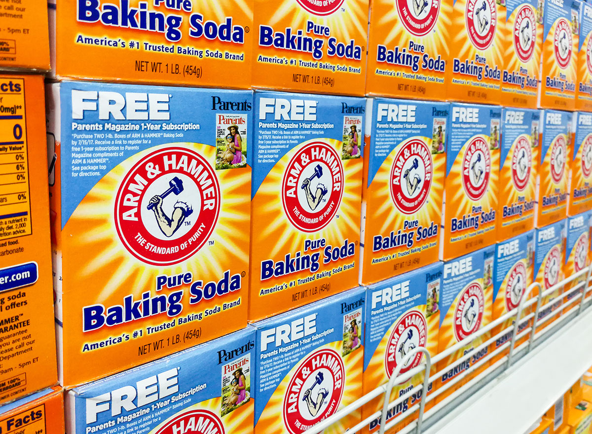
Have you ever wondered why your box of baking soda has a logo with an arm and hammer on it? Clearly, it goes with the name of the brand, but why is the logo so literal? According to Arm & Hammer‘s website, using this specific logo has a significant meaning. Arm & Hammer’s company name used to be Church & Co. after the founders, but they decided to change the name to reflect their logo’s image. The image is after a myth about a Roman god of fire who would use his mighty hammer on his anvil. It’s a symbol of power, and for Arm & Hammer, it’s also a symbol of high-quality products.
Baskin-Robbins
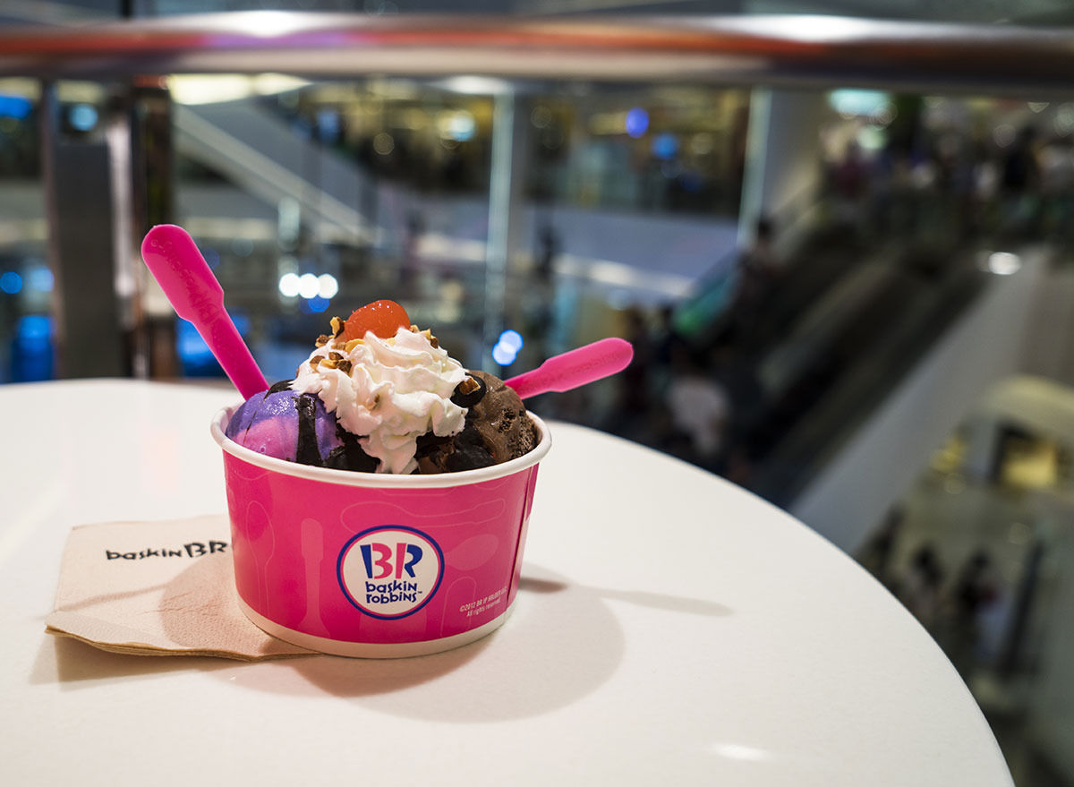
Whether you’re grabbing a scoop of Baskin-Robbins or snagging a carton of ice cream at the store, the logo actually has a clever second logo within it. Did you notice that the pink parts of the B and the R show a 31? That’s because it stands for the 31 famous flavors of ice cream that this chain serves.
Nestlé
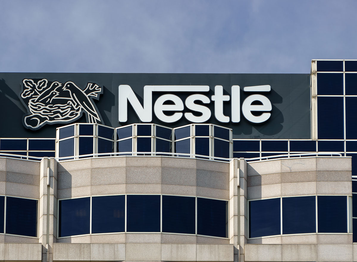
Not all Nestlé products have the little birds nest on them, but on the rare occasion, you may notice that Nestlé has a small birds nest next to it. Why? Because it originally was on the coat of arms for the family that founded Nestlé in the first place. Henri Nestlé, the founder, used their family coat of arms as inspiration for their logo because Nestle means “little nest” in German. Over time the Nestlé font and logo has made some changes, but the little bird’s nest has remained.
Pepsi
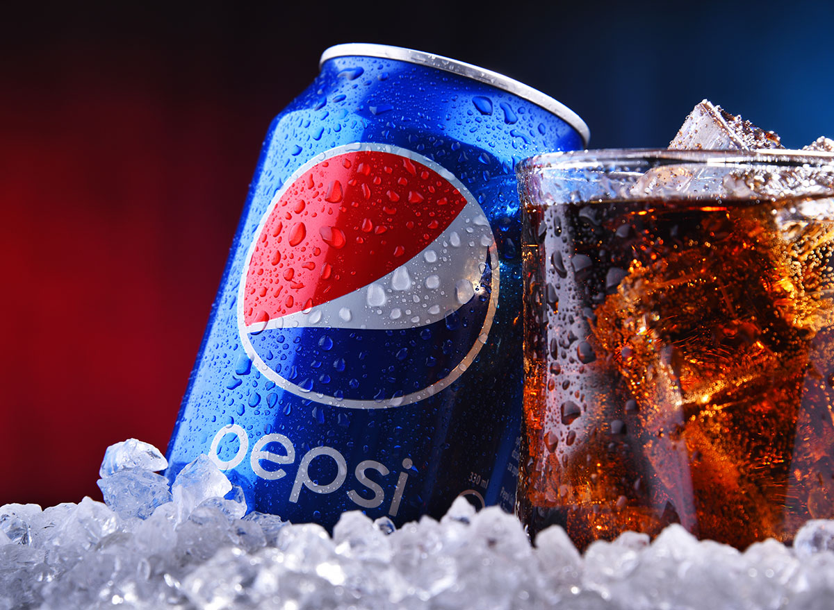
Before Pepsi donned the iconic red, white, and blue colors on their cans and products, the original Pepsi-Cola logo actually looked incredibly similar to Coca-Cola’s. However, in 1943, the company decided to make a drastic change in order to not only stand out from its competitor, but to also amplify the U.S. colors in times of war. The logo was used on bottle caps with “Pepsi-Cola” written in script on the center. Soon the “cola” part of the name was dropped in 1962 and became the Pepsi logo and brand we know today.
Duncan Hines

The Duncan Hines logo may not seem like anything particularly special, but if you look closely, the white part kind of looks like an open book. That’s because the Duncan Hines logo actually did have a book before they switched it up in order to honor the legacy of Duncan Hines himself. Duncan Hines sold many guides about restaurants and good eating in the 1930s, and provided insight and honest reviews for readers. Using a book pays tribute to his earlier work before he started manufacturing cake mixes with Nebraska Consolidated Mills (now known as ConAgra) in the 1950s.
Toblerone
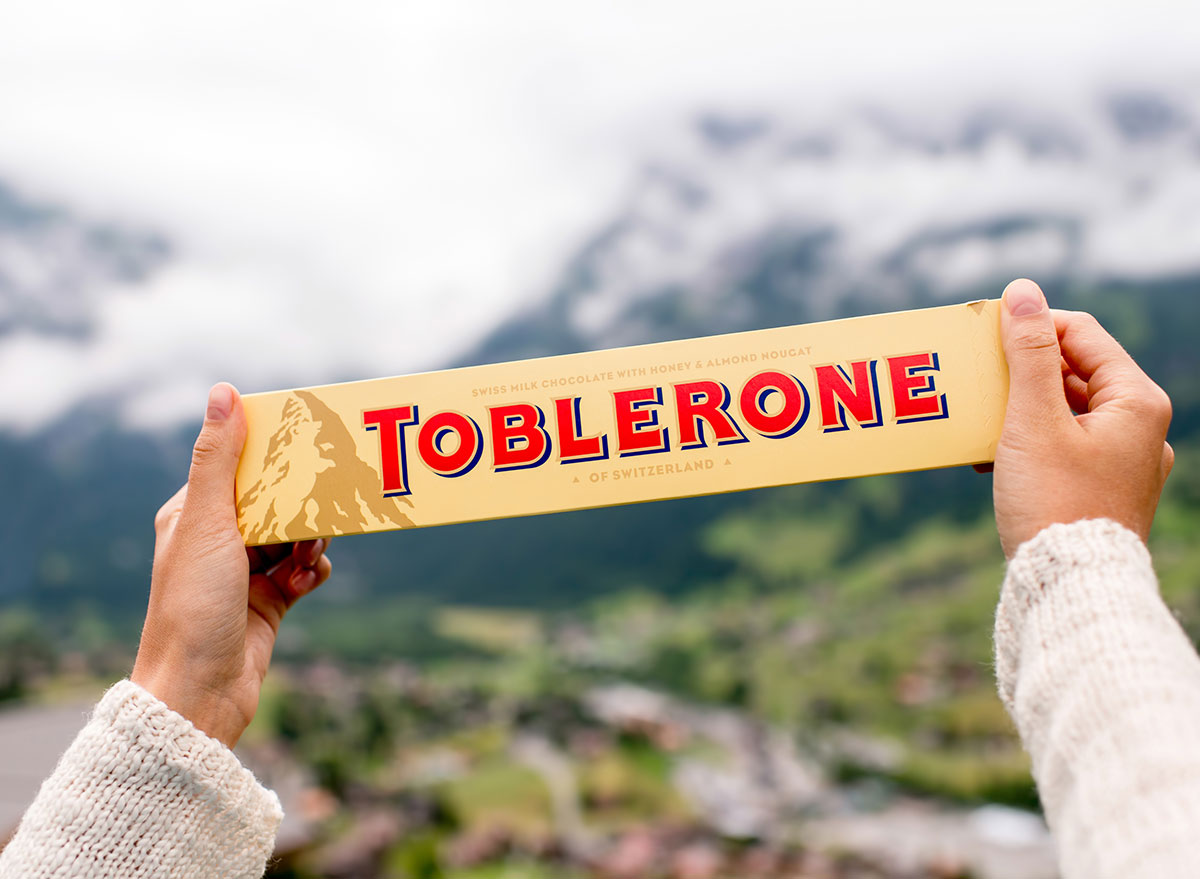
The logo on Toblerone chocolate bars just looks like a mountain, right? Look closer. Do you see a little outline of a bear? Yep, it’s there, and for a good reason! Toblerone chocolate bars were founded by Theodor Tobler in Bern, Switzerland in 1908. In the coat of arms for Bern, you will actually find a bear. So this logo pays tribute to the city in which it was founded.
3 Musketeers
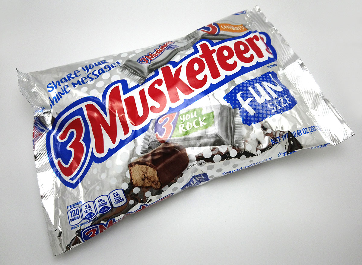
It’s no surprise that the little shield behind the 3 in 3 Musketeers symbolizes the classic story of Three Musketeers. But have you ever really thought about why this candy bar was named this way? It seems kind of random given that this candy bar is made of only two ingredients—chocolate nougat and chocolate dip. The story behind the name reflects how the candy bar used to be made, which included not one type of nougat but three types of nougat. Originally, 3 Musketeers had vanilla, chocolate, and strawberry nougat, making this bar reflect the famous name it was given. However, since the chocolate nougat was the most popular flavor, two of the Musketeers were evidently ditched in order to increase sales.